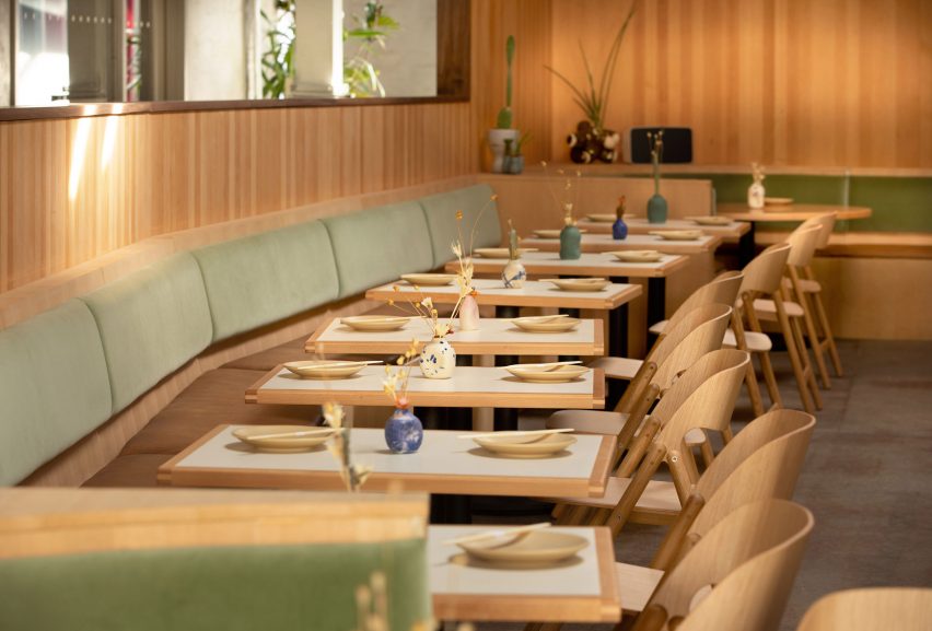
Velvet green seating is coupled with wood latticework in this Japanese restaurant located inside Brooklyn creative hub A/D/O.
Rule of Thirds occupies the rear of the 23,000-square-foot (915-square-metre) MINI-backed space in Greenpoint, which was designed by local studio nArchitects in 2016.
Design team Studio Love is Enough developed the Japanese eatery for restaurateur Sunday Hospitality. It replaces Scandinavian restaurant Norman that had previously occupied the space.
Panels of douglas fir wood wrap the walls of Rule of Thirds and low banquettes constructed from the same wood lines the perimeter of the space. The booth-like seating is upholstered with velvet jade green backrests and brown leather pads.
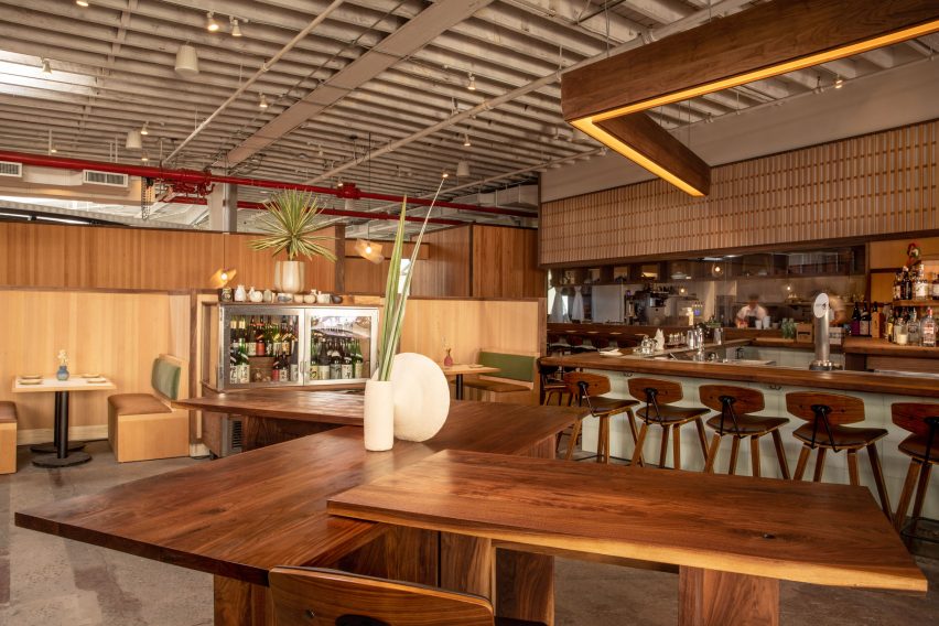
Elsewhere in the restaurant, layered walnut tables and square tables provide additional accommodation for guests.
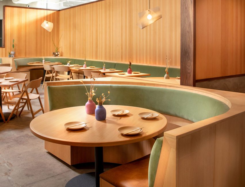
A number of elements of the design are intended to take cues from a number of Japanese aesthetics.
“The Japanese influence is also subtly echoed in the restaurant’s design, where an attention to detail creates an environment that applies custom decor elements, such as flexible wooden furniture, hand-thrown ceramic tableware, and a bespoke sake cabinet – all of which enhance the experience of the cuisine,” said A/D/O.
Panels that resemble Shoji screens extend the length of the kitchen. Like the traditional dividers, the sheets are transparent and set against a lattice frame so guests are able to watch as their meals are prepared.
A rectangular bar fronted with mint green tiles and a walnut countertop also faces the open kitchen.
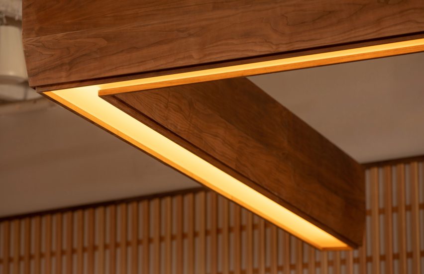
Studio Benson designed sculptural metal light fixtures that take cues from Japanese water rituals for booth lighting. A chunky rectangular wood frame inset with strips of light is raised over the bar area.
Other decorative elements in the space include leafy potted plants that are dispersed throughout the restaurant and metal sake cabinets for storing the rice wine beverage.
The team worked with several local artists and designers to bring an authentic Japanese culture to the restaurant, including plants from Tula House and ceramic bowls and sake carafes from Soto Ceramics.
These details are intended to contrast the industrial elements nArchitects left during the original renovation, like exposed plumbing pipes, ceiling rafters and concrete floors.
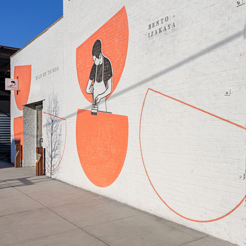
“Accessed through the courtyard in the rear of the A/D/O space, Rule of Thirds’ interior creates a cohesive and calming contrast to the industrial feel of the nArchitects-designed building,” added A/D/O.
The arrangement of A/D/O has also changed as part of the redesign. Patrons now enter the restaurant through a back door of the brickwork warehouse building.
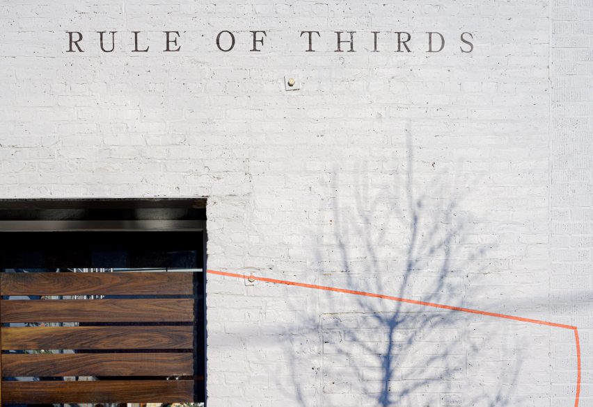
Its white exterior is painted with various words and symbols, including the restaurant’s logo of a chef preparing food, several large orange semi-circles and the names of traditional Japanese food styles served.
A/D/O is a creative hub, restaurant and tech startup incubator in Greenpoint, Brooklyn, it recently hosted an installation of several light fixtures designed by Fernando Mastrangelo’s platform for emerging artists In Good Company.
Photography is by Gary Landsman.
Source: Rooms - dezeen.com


