How you decorate your home matters—and not just because you should love the aesthetic of your space. “The color in your surroundings will have significant psychological effects,” says color expert and interior decorator Natalie Craig of Natalie Craig Design. Being able to harness those effects can help you design a home that will boost your mood, enhance creativity, and more, she explains.
Interesting, right? But it’s hard to navigate what effect colors will actually have without the help of an expert. Therefore, we asked Craig and color strategist Leslie Harrington, Ph.D, of LH Color to help us pick which shades are best for keeping the home as happy as can be.
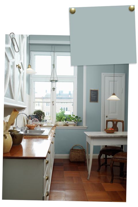
Light blue evokes calm and clarity.
Blue is complex and can have many interpretations, Craig says, but mostly it promotes a feeling of order.
The shade offers a “lighter version of calmness, and is often associated with sky and water,” Harrington says. A good way to start is to add blue as an accent wall or through pops of color around the room. Or, you can go all-in and paint the whole space — whatever speaks to you.
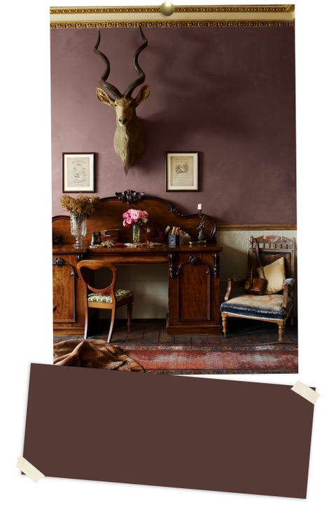
Rich purple gives you the ultimate coziness.
“Most deep colors create deep moods and are associated with richness and traditions,” says Harrington. Spot-on for spaces like a reading nook or formal library, this sumptuous hue creates the perfect setting for sitting in front of the fireplace with a great read (or a glass of wine).
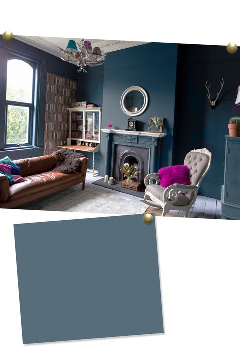
Deep blue invites warmth.
Going for a punchy hue is the perfect way to dress up the entertaining spaces in your home, like the living room. “Dark blue tends to have associations with trustworthiness,” says Harrington, so the color is a fantastic way to welcome your guests.
“Bold colors are good for adding dramatic effects, as well as creating a mood of refinement and elegance,” Craig adds.
Pale green offers a soothing connection to nature.
Like blue, green is known for its peaceful ambiance and neutrality, Harrington says. “Green is neutral and doesn’t push any buttons, as well as offering an association with nature.” That’s why it’s the ideal shade for a totally zen space or bubble-bath-friendly master bath.
Soft white feels clean and crisp.
“If you walk into a white-colored room, you may not consciously register the color’s presence at all,” Craig notes. “This phenomenon makes white and other neutrals ideal for rooms where simplicity is needed.” But simple doesn’t have to mean boring — just work in plenty of colorful accents along the way.
Source: Home Ideas - goodhousekeeping.com


