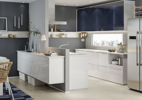
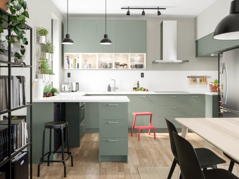
A modern kitchen’s sleek, minimal design, relies on clean lines, neutral base colors, and tidy surfaces to keep the atmosphere serene. The style serves as a calm and collected backdrop for what you choose to layer over it—a bold pattern on drawer fronts, pops of color in a backsplash, matte or shiny metals in light fixtures or pulls. It’s a place that makes mornings feel less hectic, and returning to it allows you to let out a sigh at the end of the day.
The trick to this style is carefully planning your cabinetry and storage for a well-kept, neutral look, then focusing your imagination on simple ways to bring it to life. Live by the adage “a place for everything, and everything in its place”—building in deliberate storage for everything you’ll need, your kitchen will stay tidy inside and out, keeping any stray clutter from disrupting your design (and your life).
IKEA has everything you need to get going—including specially designed, customizable storage options to keep everything streamlined. Follow along for product suggestions and tips.
A modern look is defined by everything being streamlined—symmetry of horizontal and vertical lines, simple and sleek materials, and integrated appliances and lighting. Start with a cabinet color that isn’t too busy, but has character.
“You don’t have to use just white cabinets and fronts to create a minimalist look in your kitchen,” says IKEA Senior Interior Design Leader Viola Mushkudiani. For example, she adds, there is a trend toward matte finishes and muted, warm, or organic colors.
Dark gray
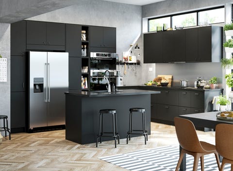
Dark gray is a classic, sleek neutral that hides more wear than a white or beige. And if you choose an option that has a push-to-open function, the cabinets fade into the background especially easily.
Green-gray
Keeping things neutral doesn’t mean avoiding color. A muted green makes a fantastic base when you need a little bit of oomph for your blank slate.
Bright white
Bright white has a timeless feel to it. Choose cabinets that are high-gloss and they’ll make a statement without showing off too much—and they’ll be easy to wipe clean.
Black
A classic neutral that also plays with a little drama, black lends a certain moody sophistication to a kitchen.
Maintain the serenity of your minimal-facing base (those sleek cabinets, et al.) by incorporating storage that keeps things from getting busy or cluttered. It’s an asset here to add internal components that meet your needs and play well together.
“Kitchen pull-out fittings and cabinet organizers turn chaotic drawers and hard-to-reach corners into things of beauty and efficiency,” says Mushkudiani. “From waste sorting to cookware organizing, these unsung heroes will make your everyday cooking routine sing.”
Pull-out recycling bins
If you regularly recycle (that’s a good thing!), it can pile up, so keep your kitchen tidy and organized by stowing it away in a cabinet until haul-away day.
Spice organizers
Spice storage gets chaotic really easily. A drawer insert keeps jars tamed in neat rows, away from your packed upper shelves or precious counters.
Wooden knife tray
Maybe you’re not keen on magnetic storage. That’s fine; a knife tray lets you stash your knives in the cutlery drawer while preventing them from getting jostled around.
Protect (and organize) your plates
Storing your plates huddled together in a holder serves multiple purposes. They’ll avoid sustaining bumps and cracks, are easily transported to and from the table, and are adjustable to different sizes.
Now that you’ve assembled the canvas, warm your kitchen up with personal touches. By focusing on design details where it really counts, you can achieve a look that’s both elegant and cheerful—the kind of design ethos that made IKEA products household staples to begin with.
Bold backsplash
A backsplash serves many uses in the kitchen, and why not make it a statement? Resistant to heat, water, grease, and dirt, it keeps the wall behind a kitchen countertop or cooking surface neat and easy to wipe clean. You can even create a uniform look by choosing to use the same color or pattern as your countertops.
A graphic drawer (or a few!)
IKEA tapped the Swedish design collective 10-gruppen to design different patterns for cabinet fronts, like black-and-white stripes; add just one or a few to neutral cabinetry to create more visual interest.
Metallic pulls
Punchy pulls are the ideal low-investment, high-impact addition to a kitchen. Try a clean, modern design that doesn’t complicate a minimal aesthetic.
Geometric pendant
A metal pendant lamp that employs crystalline linework will cast artful patterns on cabinets and walls. A round bulb would look great here, but you can experiment with different shapes and colors to augment the look.
There’s no need to complicate a minimal kitchen look. Whether you need help visualizing what is possible, or are looking for a partner in making your dream kitchen come true, IKEA Kitchen Services is here to help. Schedule an appointment to get started.

