Nut-coloured walls and bronze mirrors feature in the two-tone Buddy Buddy cafe in Brussels, which serves up speciality coffee and nut butters that are made on site.
Designed by Amsterdam studio HOP Architects, the 70-square-metre Buddy Buddy cafe is located on the ground floor of the city’s UN Studio-designed Le Toison d’Or building.
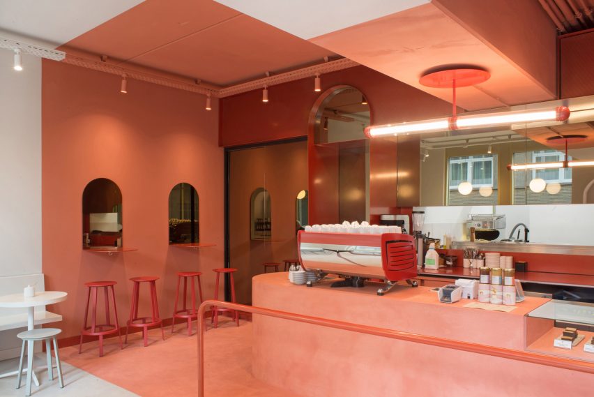
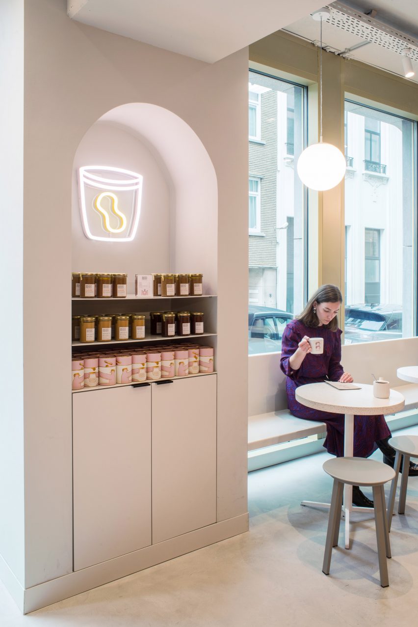
The owners make their own variety of nut butters on site, which are served in the cafe on toast and alongside other ingredients.
To celebrate the fact that Buddy Buddy is both a cafe and nut butter atelier, the designers decided to create a two-tone interior.
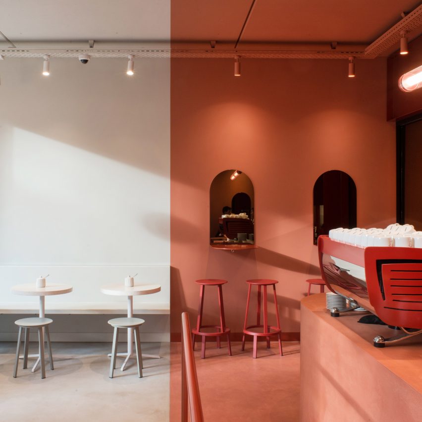
The curved counter and high seating areas that line the back half of the space and are finished in warm, nut-inspired colours including a metallic red paint.
The other half of the space, nearest to the window, houses low seating areas and is finished in warm, milky-white colours that complement the building’s grey facade.
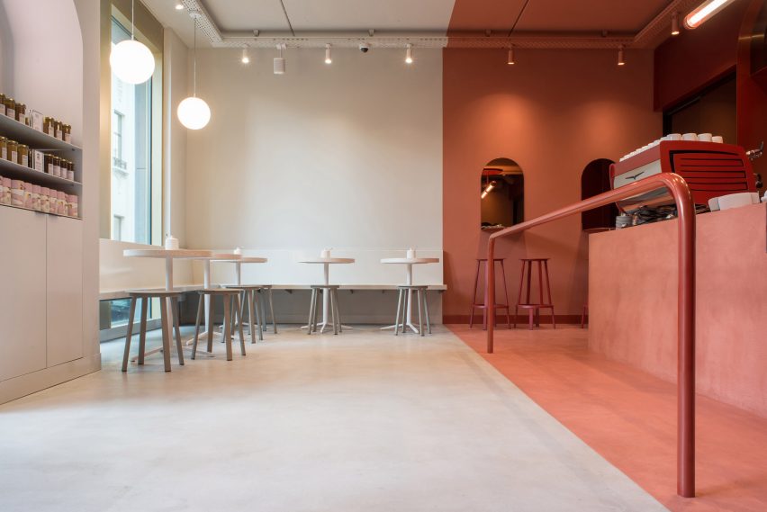
The two-tone effect is applied to the walls floor and ceiling to create a sharp contrast. HOP describes the zone in the middle of the cafe where the two colours meet as a “free zone” where customers can “wait, wander, linger, look around or take selfies”.
“The materialisation of the interior of Buddy Buddy plays a key role in the design,” said HOP, which stands for Habitats of People. “Every little detail within the interior of Buddy Buddy is carefully thought out and complements the colourful character of the owners and the tasty experience of their nut butters.”
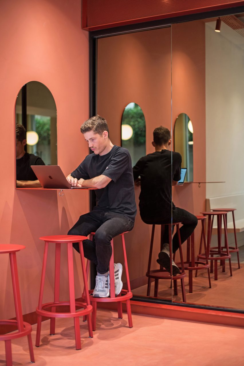
Almost all of the fixed furniture in the cafe is built from custom powder coated steel elements while the floor and service counter are finished with a vibrant mortex coating.
Large bronze mirrors were installed to create depth in the compact space.
The steel back wall was built up out of large and heavy elements that were prefabricated in the Netherlands and constructed on site by a team of workers.
The playful and colourful images that feature across Buddy Buddy’s packaging and accessories were designed by branding company ByFutura.
In Athens design studio AK-A created a two-tone interior in this bright white restaurant by painting the bottom half of the walls in glossy green paint.
Photography is by Michael Cerrone.
Source: Rooms - dezeen.com


