American interior designer Kelly Wearstler scoured vintage shops to source the eclectic furniture that decorates the living room-style lobby of this hotel in Santa Monica, California.
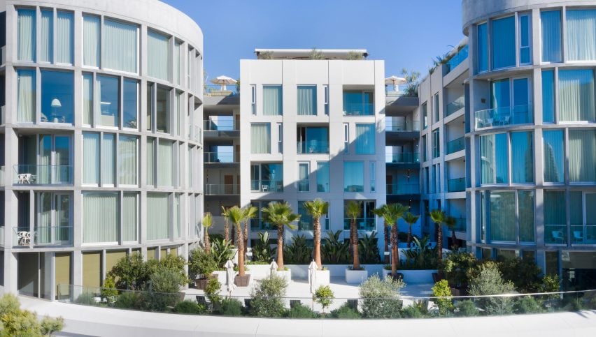
Santa Monica Proper occupies the 1920s Santa Monica Professional Building and a curvilinear extension designed by local firm Howard Laks Architects.
Located on Wilshire Boulevard in the coastal Californian city, it forms the lastest in the Proper hotel chain Wearstler runs with her husband Brad Korzen and Brian De Lowe.
Photograph by Mathieu Salvaing
Wearstler also designed the San Francisco Proper that features clashing patterns, colours and textures, and vintage furniture.
The interior designer developed the Santa Monica outpost to incorporate a similarly eclectic mix of details in palettes that allude to its beach setting.
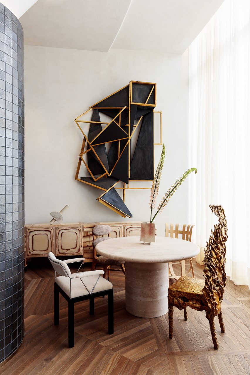
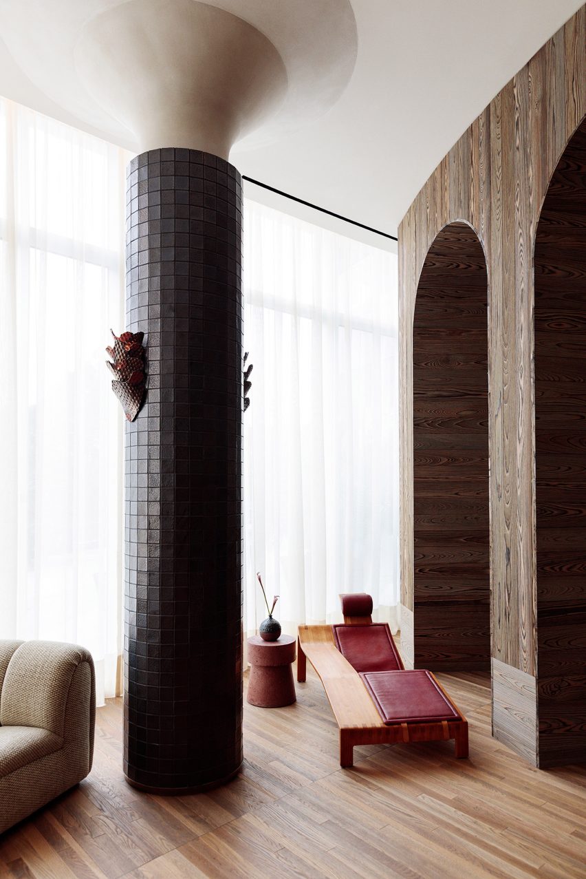
The sprawling lobby and ground floor restaurant contains a mix of contemporary furniture and repurposed finds from vintage shops. She chose the eclectic mix paired with various greenery to make it feel like a large living room, to encourage visitors to relax.
“When we started with all the design, we started shopping for all the furniture and it took quite some time,” Wearstler told Dezeen.
“They are not just the normal vintage pieces that you would associate with California easy living,” she added. “There’s a lot of really great anomaly.”
Photograph by Mathieu Salvaing
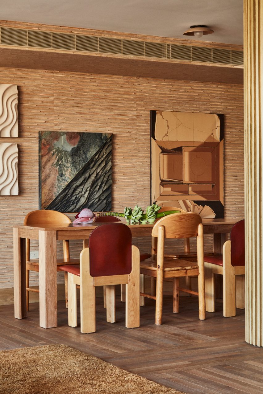
There are a number of different seating areas designed for both working or enjoying a drink from the bar. These include tables decorated accompanied by different chairs, and white nooks fitted with curved sofas.
Photograph by Mathieu Salvaing
“It’s a really great meeting place until we created these alcoves that are really great spaces for dining, meetings and just hanging out,” the designer added. “It just feels someone’s living room. It’s just super relaxed. It’s easy.
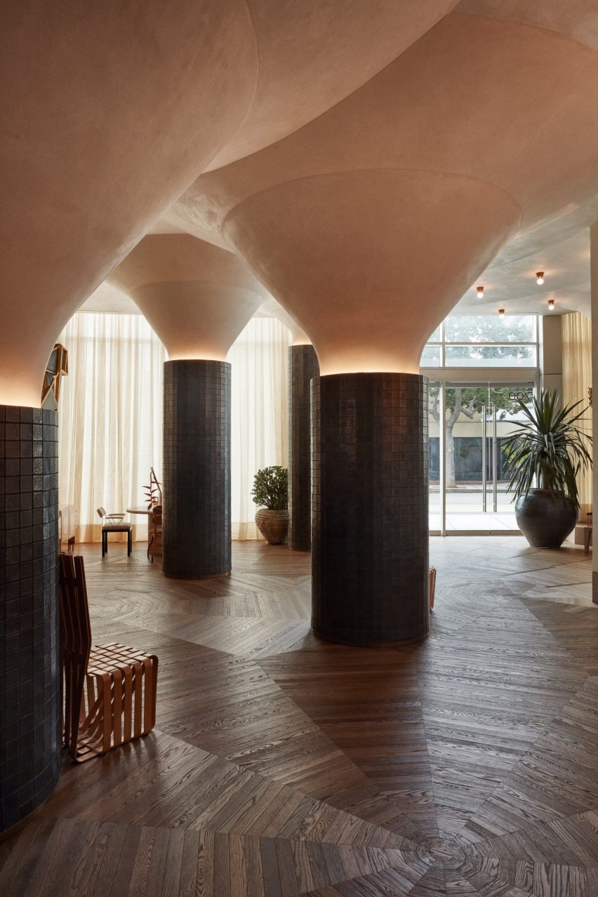
The lobby is punctuated with huge, tile clad columns with bulbous tops. Walls are rendered with hand-troweled, pitted gritty plaster texture and the floors are covered in patterned woodwork.
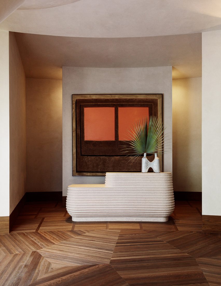
“If you have a bird’s eye view on the reception, the pattern of the wire brushed oak hardwood floors is reminiscent of opened umbrellas,” Wearstler said. “So there’s a lot of very multi-directional activity on the floor, which was really interesting in this curvaceous shaped reception.”
The designer chose pitted travertine, more commonly used as a building material, to make a reception desk. The front is covered in striations that are reminiscent of a beach shell.
Other details include a large pair of fan-shaped bamboo wall lights designed by Ingo Mari.
“Those are quite amazing to find a pair; there was only a very small amount produced and they were actually made in a small village in Japan,” Wearstler added.
Photograph by Mathieu Salvaing
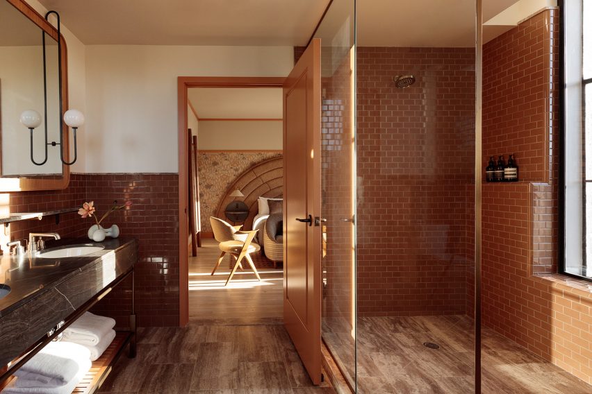
Santa Monica Proper has 271 guest suites split across both the landmarked building and the new structure. Wearstler chose floral wallpaper and deeper hues for the rooms in the existing building and a muted, neutral palette for those in the extension. Textiles and wall coverings are from the designer’s own collection.
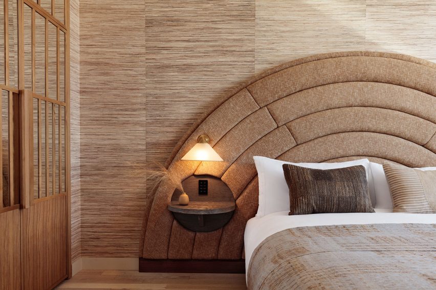
A common theme across the two buildings is a curved headboard in the hotel rooms. “The bed is a radius headboard that reminded me of a sunset in California,” she said.
Photograph by Mathieu Salvaing
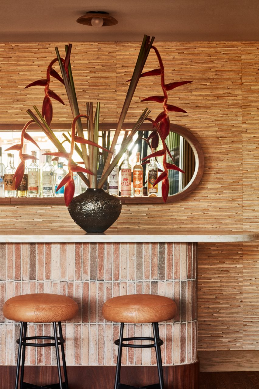
The hotel also has a rooftop – a key feature for each Proper outpost. In Santa Monica, this includes the restaurant Calabra decorated with richly textured dark wood, brickwork and stone.
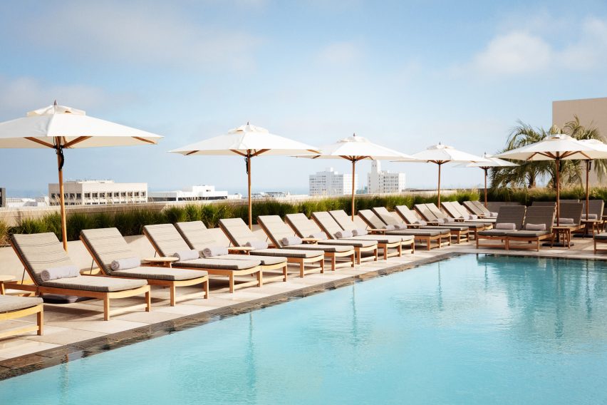
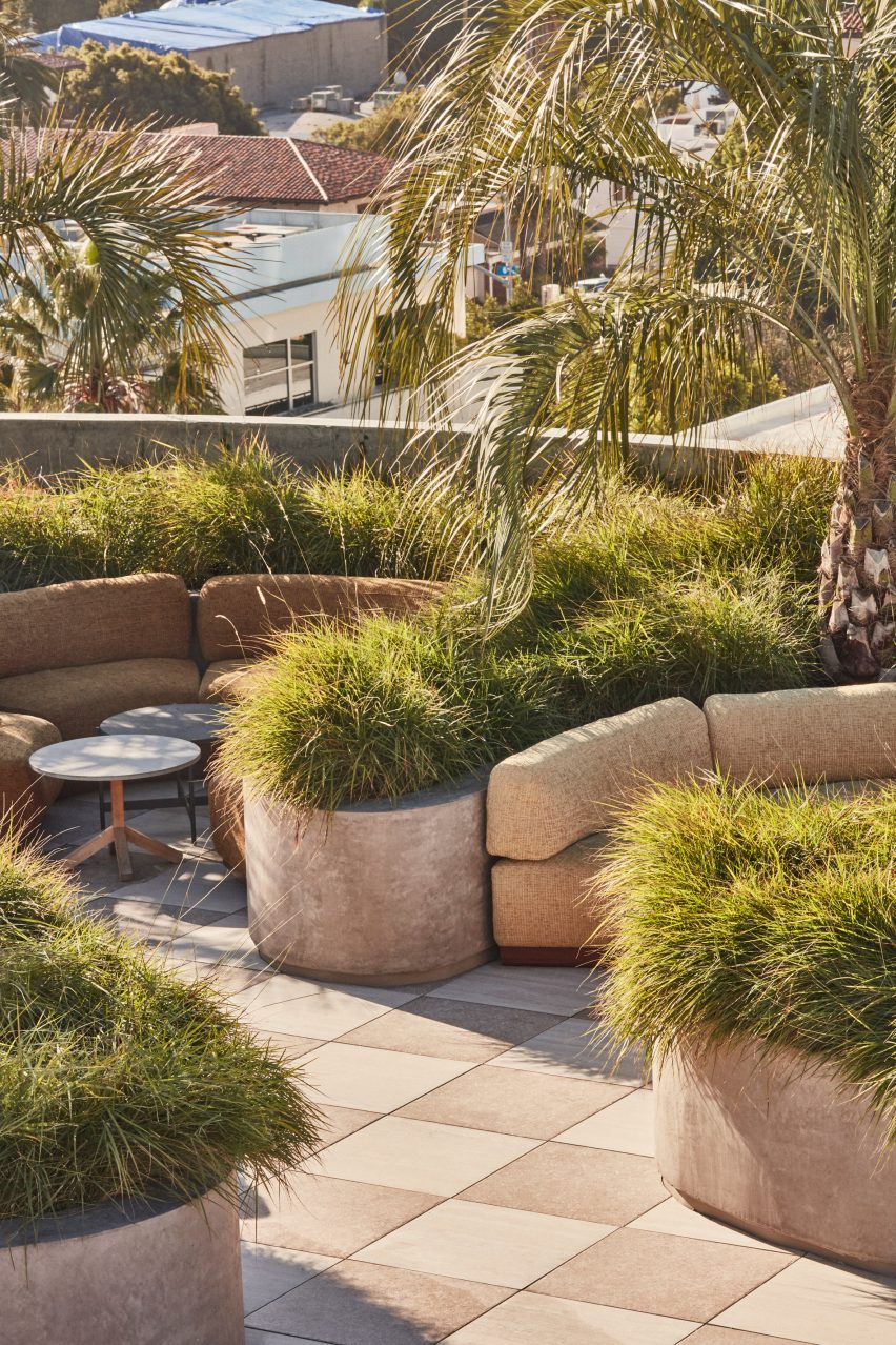
A private swimming pool and deck is located to one side of the rooftop. Near its entrance, it features nooks reminiscent of those in the ground floor lobby. The rear is more open and comprises curved seating areas tucked among large plants.
Photograph by Mathieu Salvaing
Santa Monica Proper is completed with another restaurant, called Ondo, located on the ground floor of the historical building, and a fitness centre. An ayurvedic spa will also open later this year.
Photography is by The Ingalls, unless stated otherwise.
Source: Rooms - dezeen.com


