Mesh panels dipped in paper pulp, polycarbonate and OSB timber merge to form the textured interior of this lifestyle store in Nanjing, China, designed by architecture studio CATS.
Located along a narrow alleyway next to the city’s China Modern History Museum, the Shiwu store sells a selection of products handmade by Japanese craftsmen such as pottery and clothes.
According to Shanghai-based CATS, the area is largely known for its loud crowds, cheap souvenirs and fast food. In contrast, the studio wanted to create a calming retail space that’s closed off from its busy surroundings.
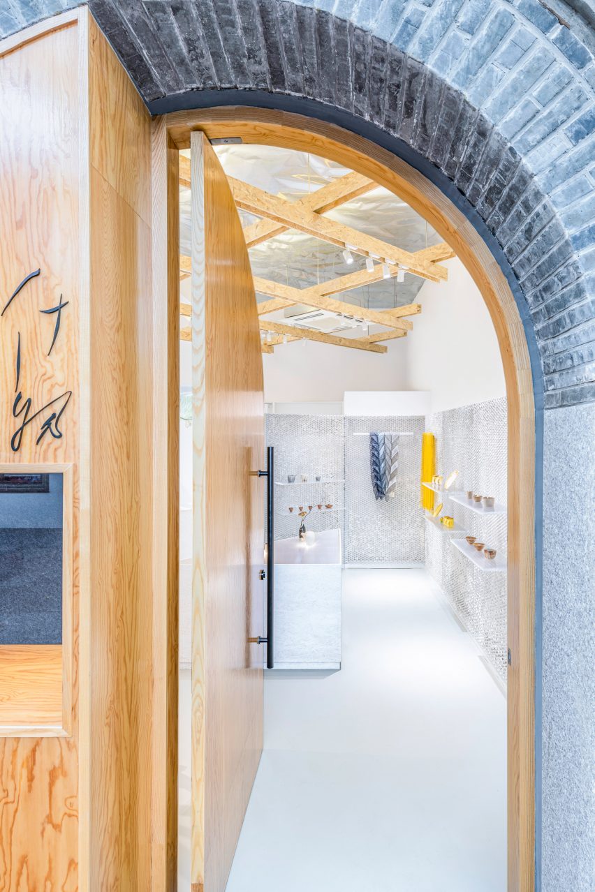
Customers enter the store through an arched wooden door, which they pull to open.
“The gesture of pulling distinguishes the shop from its touristic neighbours,” the studio said. “[The shop] reveals its internal quiet and relaxed atmosphere in an unanticipated manner.”
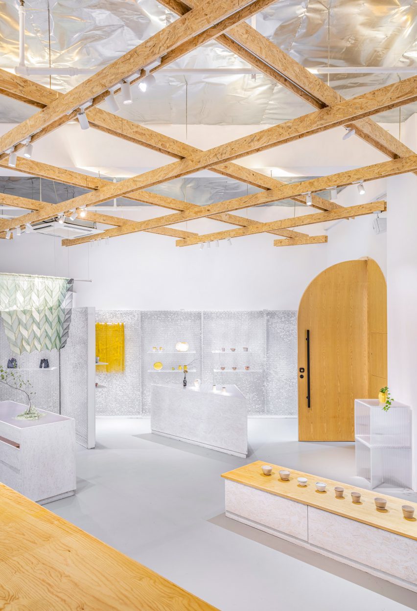
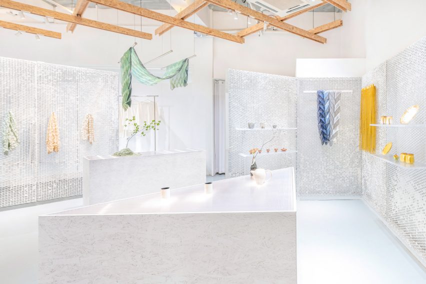
Panels of expanded metal mesh wrap the peripheral walls of the store and, in places, extend into the space to serve as semi-transparent partitions.
Polycarbonate shelves and hooks for displaying products are hung from the mesh.
“We carefully selected a custom aperture dimension that best fits standardised hangers, so that there could be no limit in terms of where the objects or shelves could be fixed,” the studio explained.
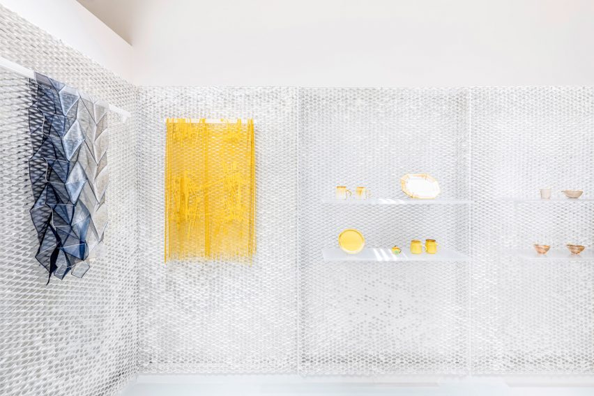
In an effort to soften the appearance of the store’s metal surfaces, the architects also dipped each mesh panel in paper pulp to create a slightly webbed effect across its openings.
“After going through many surveys and experiments, we discovered an ancient Chinese formula of paper pulp, which is very fibre-rich and adhesive,” said the studio.
“Before execution on-site, we tested the transparency of the pulp web in our studio. We then dipped and dried 20 sheets of metal mesh on the construction site by ourselves,” it continued.
“The appearance of these pulp webs is constantly oscillating, due to the unevenness of pulp attachment to the metal mesh. Depending on where the viewer is standing, these webs will look rigid or soft, blurred or transparent, closed or open.”
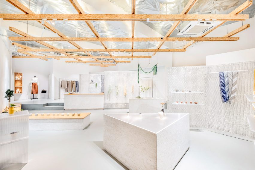
Fixtures and fittings are laid out across the store’s rectangular floor plan at a 45-degree angle. A grid of beams made from oriented strand board (OSB) has been suspended overhead.
The 1.4 by 1.4-metre grid functions as a lighting rig, with LED strips embedded into the top of the beams. The lights shine upwards onto a reflective ceiling that’s clad with a sheet of one millimetre-thick galvanised steel.
“This system provides evenly distributed brightness that floods over the floor, improving visual comfort and diffusing unpleasant shadows,” explained the studio.
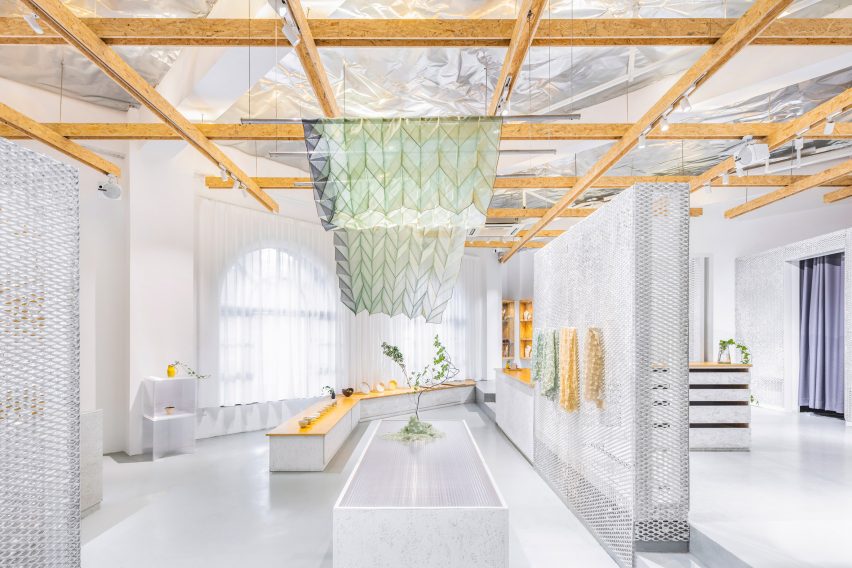
The grid is also used to hang swathes of colourful fabric by Japanese artist Reiko Sudo, which can perform as soft partitions within the space.
Across the shop floor, objects are displayed on different-sized plinths and shelves crafted from OSB board with polycarbonate or glossy wood countertops.
An area dedicated to clothing is located at the rear of the store in an elevated, more private zone.
CATS isn’t the only studio to make use of paper pulp. Back in 2017, Carmody Groarke sprayed the material across the basement walls of London’s Design Museum to produce a cave-like exhibition space for the Designs of the Year show.
Kengo Kuma Associates also threw paper pulp at mesh panels to create light-filtering screens inside Paris’ Archives Antoni Clavé.
Photography is by Dirk Weiblen.
Source: Rooms - dezeen.com


