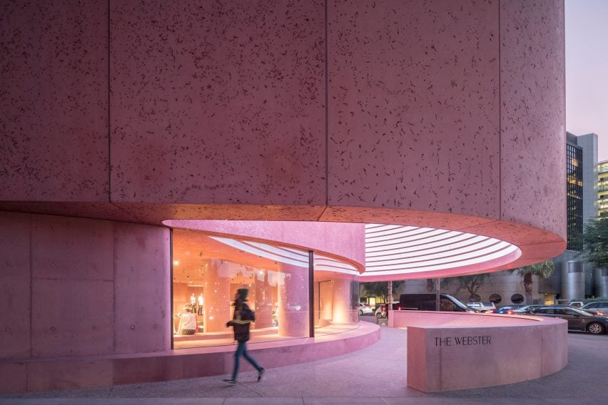
David Adjaye has used pink-tinted concrete to form a “tough and gentle” store in Los Angeles for fashion retailer The Webster, which marks the British-Ghanaian architect’s first project in California.
Adjaye Associates was enlisted to create the 11,000-square-foot (1,022-square-metre) flagship store for the luxury retailer at the base of the Beverly Center.
Photograph by Laurian Ghinitoiu
The pink-tinted concrete walls are intended to both complement and contrast the exterior of the brutalist-style building above.
The walls also form part of a series of work by Adjaye that plays with the material, such as the crimson Ruby City art centre in Texas.
Photograph by Laurian Ghinitoiu
“In the past five years I’ve started to work with a lot of saturated red and pink hues, which extends back to the early colour experiments I did at the beginning of my career,” said Adjaye.
“Pink felt like fashion, but I wanted to make something that was tough and gentle at the same time.”
The Webster’s front is curved to mirror the front of the existing shop above. It is separated into two halves, with a much larger upper half that projects from underneath the shopping centre above, to create a covered entrance to the shop.
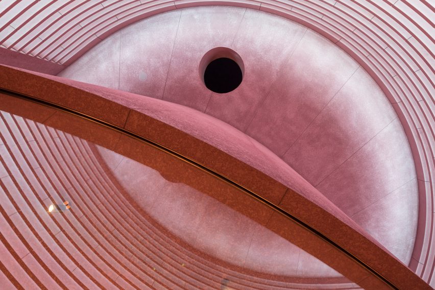
On the inside of the cantilevered wall, Adjaye has created a series of alcoves that are fitted with lights. It is designed to act as a large-scale digital screen that will showcase artworks at an “intentionally low resolution”.
Underneath, the firm has also built a shorter, curved concrete wall that wraps a moon-shaped pool of water. The wall can also be used as a bench that faces the street.
To break up the monolithic concrete mass and provide glimpses inside the store, the firm has lined the front with a long glass window.
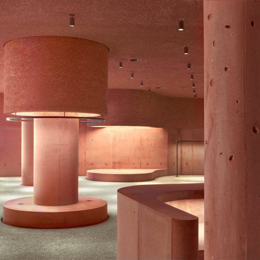
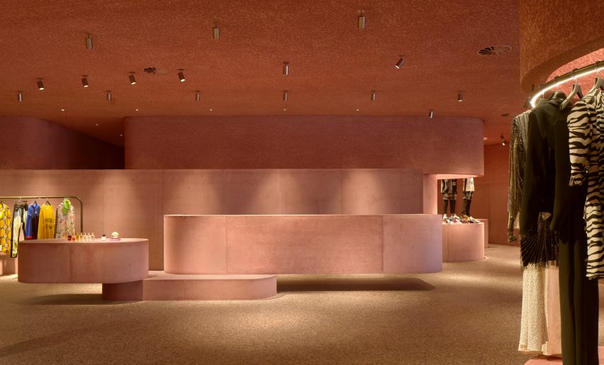
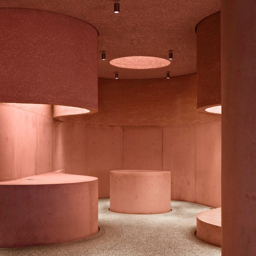
The interiors continue the pink, stony aesthetic of the exterior with curving walls that enclose the changing rooms and concrete display plinths. A number of concrete columns punctuate the space and mark display areas for different brands and items.
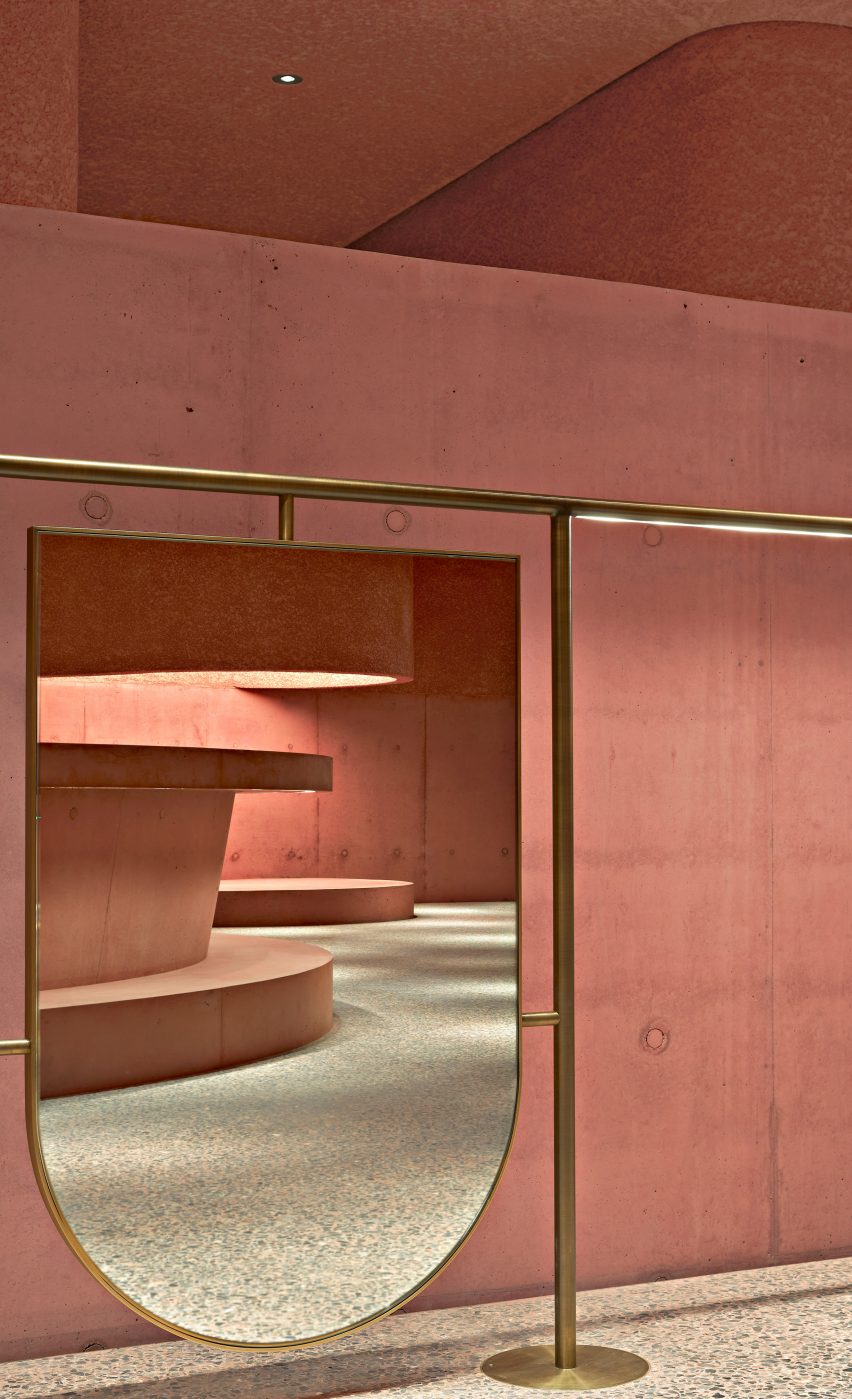
The pink concrete has a smooth finish on the lower part and a rough texture above, while the terrazzo floor is covered in grey concrete with fragments of black cherry marble.
Additional materials used in contrast to the concrete, like the delicate bronze display racks and mirrors with bronze frames. The upper part of the walls in the changing rooms is covered in a floral, vintage 1950s wallpaper.
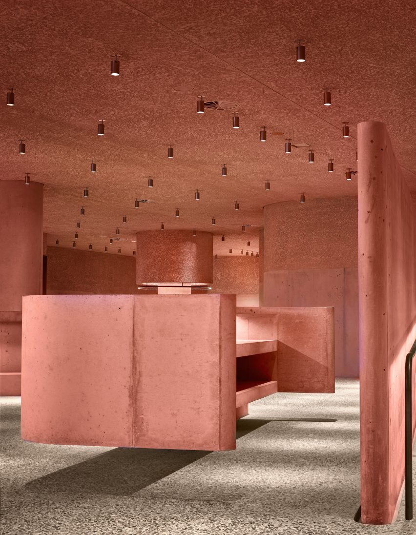
The Webster is Adjaye Associates first completed project in California.
Other US commissions for the firm, which has offices in London and New York, include Washington DC’s Smithsonian National Museum of African American History and Culture. It has also designed 61-storey skyscraper in New York which is currently under construction.
Photography is by Dror Baldinger, unless stated otherwise.
Source: Rooms - dezeen.com


