Architects Tyler Thomas and Gabbi Sun of Venn Studio have paired “masculine-feminine, hard-soft” details inside this cosmetics store for a unisex beauty brand in Los Angeles.
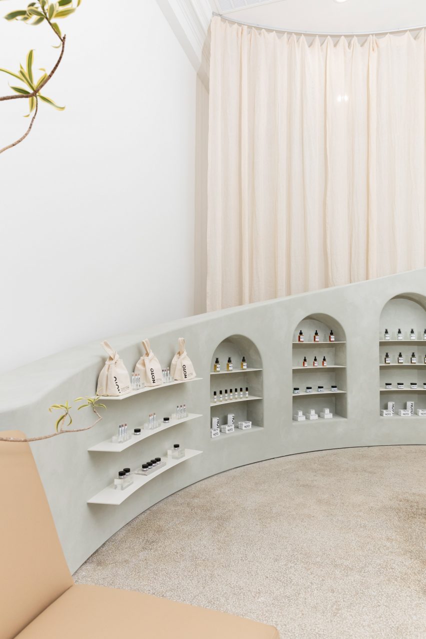
Thomas and Sun, who work at local architecture practice Venn Studio, designed the aesthetics of the shop to represent the philosophy of Noto Botanics – a brand founded by Gloria Noto that specialises in organic products.
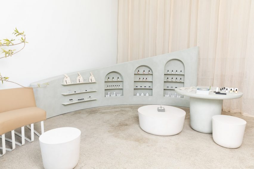
“The overall concept for the store is very much about questioning and exploring supposed dichotomies,” Thomas told Dezeen.
“Masculine-feminine, hard-soft, art-retail, function-beauty, organic-synthetic in the same way that Noto challenges standards of representation in the beauty industry.”
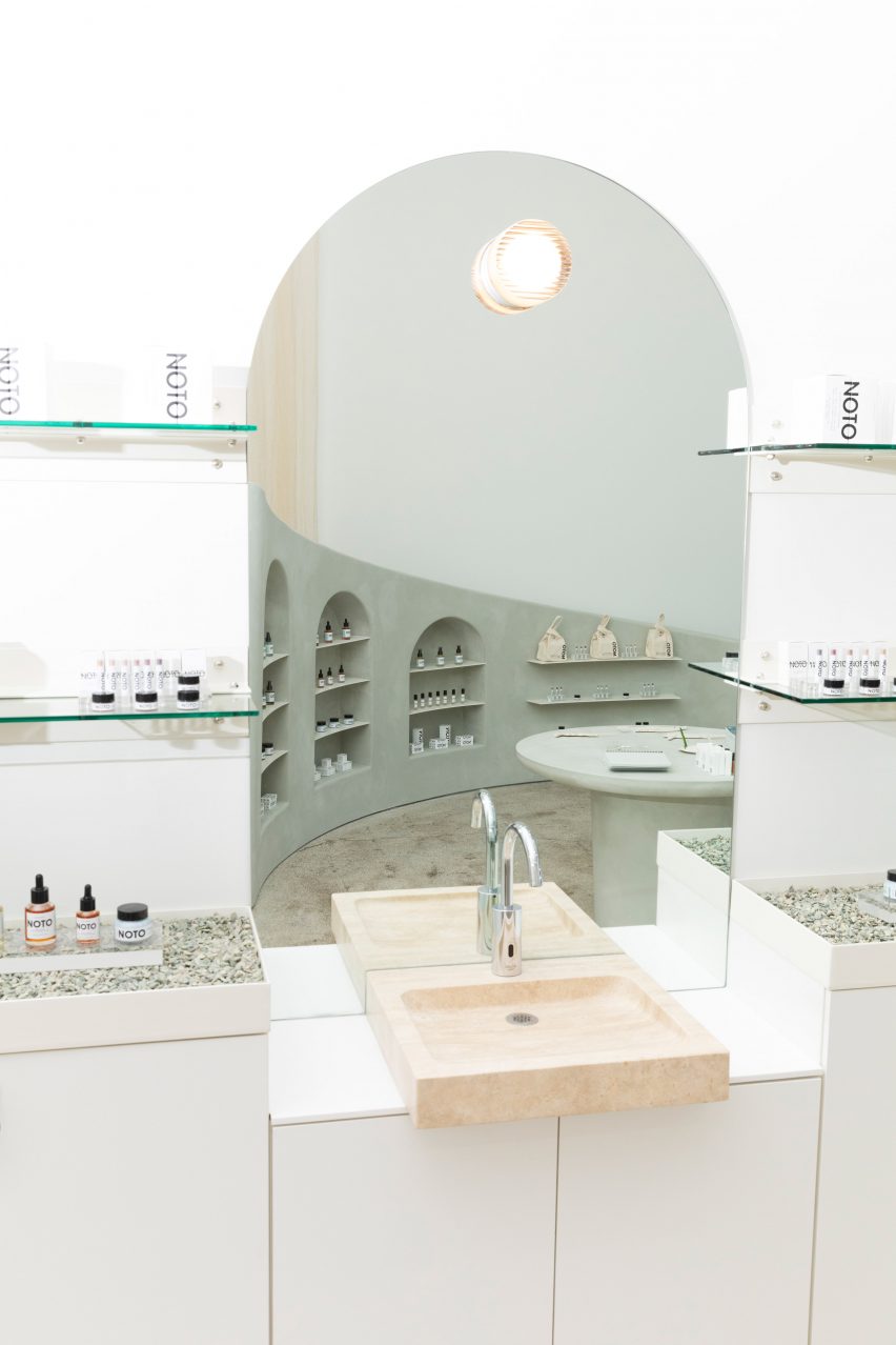
Noto worked closely with the duo to create a comfortable environment for customers to try on and test products, with details that nod to the items for sale.
“I wanted the interior to feel gender-neutral, timeless, natural, and minimal,” she told Dezeen.
A soft, cream-and-white decor is contrasted by harsher surfaces like gravel and concrete throughout.
Other details include a white powder-coated display cabinet that has shelves in glass and steel. Counters on either side of a travertine sink have metal trays filled with crushed gravel.
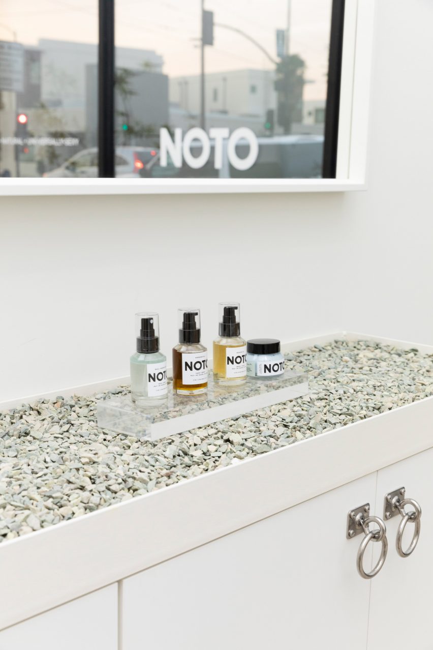
“We chose a palette of materials to promote a neutral and calming environment that would serve as a backdrop for the rotating products and people congregating in the space,” Tomas said.
“Many of the products are highly pigmented and the guests very vibrant and engaged, so we felt that the physical space needed to complement that.”
Located in LA’s Highland Park neighbourhood, the Noto Botanics store is one of four units that were formerly a Chevrolet car showroom in the 1950s.
Existing white and beige terrazzo floors remain in the shop and add to the various textures and warm palette inside.
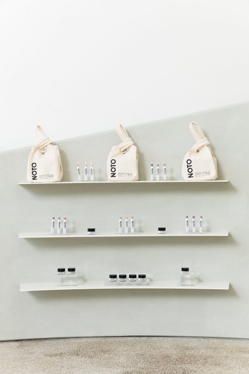
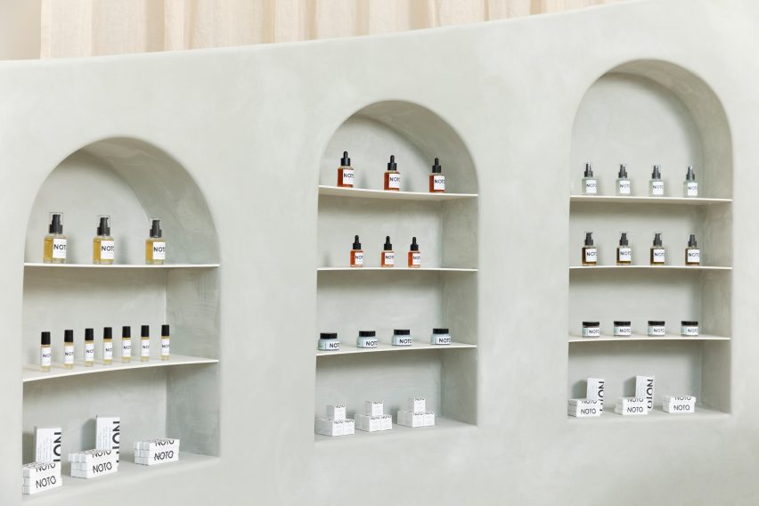
The team inserted a wall into the store punctured with arched nooks for displaying products.
It is painted a pale green hue, intended to be reminiscent of moss that grows on trees in the Pacific Northwest, and is a lime-based finish made from mixing crushed limestone and water.
“The curved display wall is clad in a mossy coloured limewash finish that is meant to be inviting and reminiscent of the colours found in the Noto products,” Thomas said.
The design echoes the series of plastered walls in another store in the city for jewellery designer Sonia Boyajian designed by Studio Shamshiri.
In Noto Botanics, a large window brings natural light into the rectangular store, which measures 730 square feet (68 square metres), and is accessed from a separate entry nook.
Upon entering, is a sitting area upon entering that has a U-shaped caramel sofa, custom-made for the shop, with a white steel base.
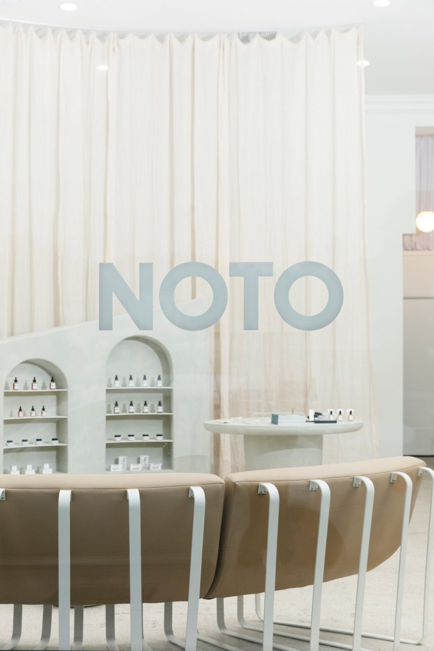
The couch is modelled on Swiss designer Ueli Berger’s 1972 Snake Sofa, and is accompanied by low white concrete coffee tables with a custom limewash finish to tie in with the rest of the details in the store.
Rounding out the project are cream curtains that act as a wall to divide an office and storage area, while also adding warmth and softness.
Noto Botanics joins a number of design-focused beauty stores – including London’s floral-filled Glossier pop-up, a stark white space for Zalando in Berlin, Fig facial bar with scalloped green walls in Vancouver.
Source: Rooms - dezeen.com


