Hanging plants, used books and a bar salvaged from New York are among the diverse elements incorporated into an eatery and bar in Texas conceived by architecture studio Clayton & Little and interior designer Mickie Spencer.
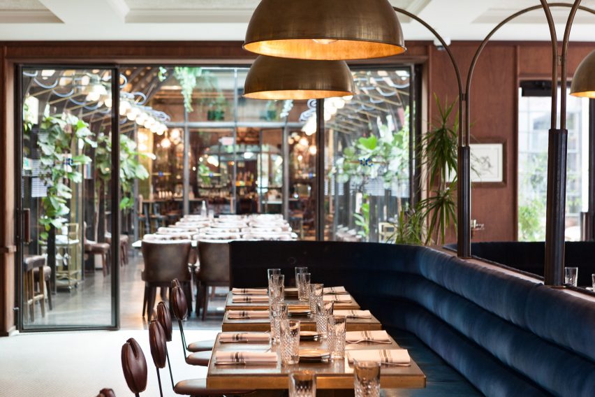
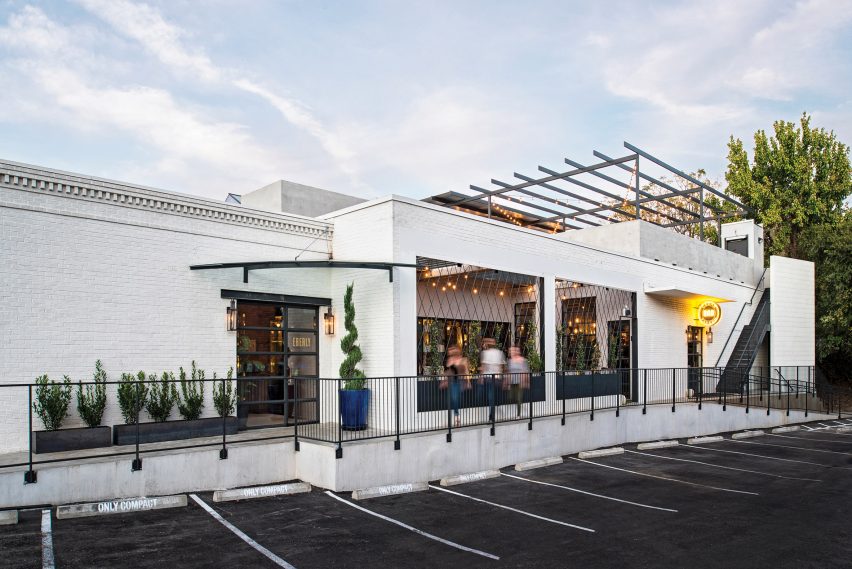
The Eberly occupies a 1970s brick building that formerly housed a print shop. The restaurant – which serves up contemporary American fare – is positioned on the edge of downtown Austin within walking distance of shops, offices, parks and event venues.
Designed by the architecture firm Clayton & Little and interior designer Mickie Spencer, it contains a series of rooms, each with a distinct look. The design is meant to provide a sense of exploration and to “reflect the Texas capital’s independent spirit”.
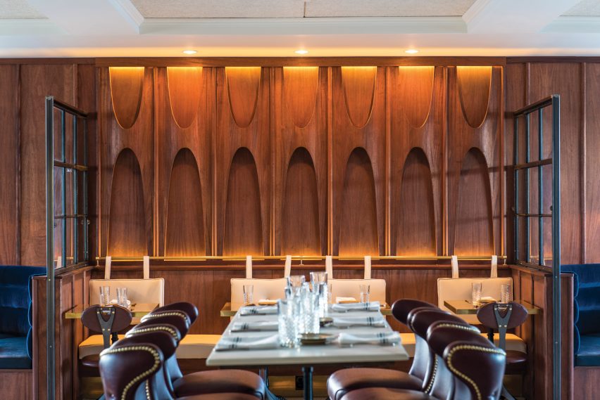
“Eberly was conceived as a gathering place where risk takers, creative types and liberated thinkers could connect and feed off of each other’s energy,” the team said in a project description. “The establishment’s visually layered spaces support this intent.”
Encompassing 10,000 square feet (929-square-metre), the building contains three main areas: the Cafe, the Study, and the Cedar Tavern. There also is a small, private bar area called the Cannon Room and a rooftop bar.
The primary entrance leads into the Cafe, which has a “dark, almost brooding atmosphere”.
This area – which acts as the main dining room – features a coffered ceiling, tile flooring, and mahogany wall panels inspired by art nouveau and mid-century modern design. Brass and blue velvet are among the additional materials found in the space.
Running through the centre of the room is a long banquette that can accommodate dining parties of varying sizes, including a large group. The room also features a curving bar and arched nook for liquor bottles.
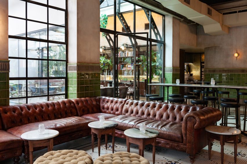
Adjacent to the Cafe is the Study – a long, slender room that was inspired by Victorian-era English greenhouses. The team added a glass roof monitor above the space to enable plenty of natural light to fill the interior. A glazed wall provides a connection to an outdoor courtyard.
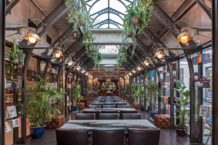
The Study is adorned with plants, curios and books that give the space a lived-in feel. Affixed to steel structural units are custom wall sconces that play off the building’s industrial character.
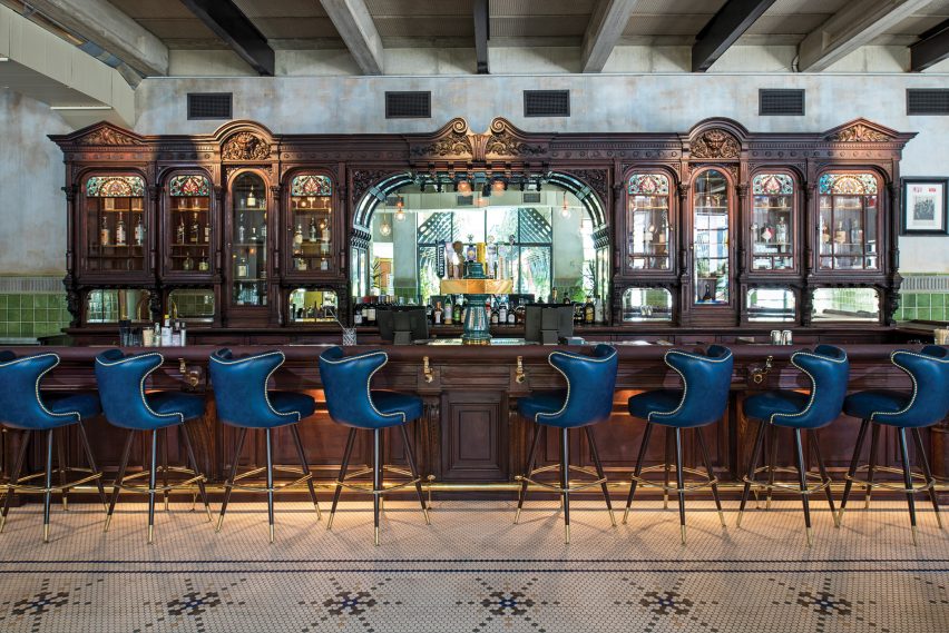
Beyond the Study is the Cedar Tavern, which is named after a bar in New York’s Greenwich Village that was shuttered in 2006. The tavern first opened in the 1860s and became a popular hangout for avant-garde artists and writers in the mid 20th century.
When the tavern closed, the Eberly’s owners, John M Scott and Eddy Patterson, purchased its hand-crafted mahogany bar, which is 30 feet (nine metres) long and 10 feet (three metres) high.
The salvaged bar was transported to Austin and restored, and then installed in the Eberly, where it is surrounded by “a creative atmosphere worthy of the original”.
In addition to the historic wooden bar, the tavern area features blue stools with brass tacks, tufted leather sofas, and stone-topped coffee tables. Walls are partially sheathed in glossy green tiles.
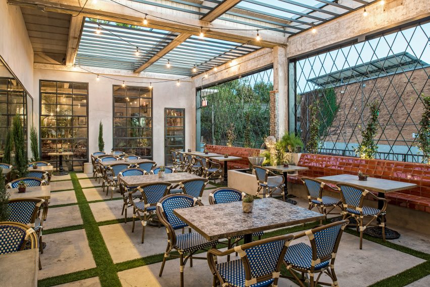
Overall, the Eberly’s varied environments for dining and drinking are meant to foster a sense of discovery.
“Visual layering and spatial connectivity, along with stylistically distinct yet complementary interiors, serve as an invitation for patrons to explore,” the team said.
Other new restaurants in Austin include a Mexican eatery by Olson Kundig that features glass doors operated by hand cranks, and a spacious and bright eatery called Hank’s that is housed within an old grocery store.
Photography is by Merrick Ales and Chloe Gilstrap/Clayton & Little.
Project credits:
Architecture: Clayton & Little
Design team: Paul Clayton (principal), Sam Manning (project architect)
Interior design: Mickie Spencer
General contractor: ICON Design + Build
Structural engineer: JM Structural Engineering
Mechanical and electrical engineer: Bay & Associates
Kitchen designer: N Wasserstrom & Sons
Civil engineer: Longaro & Clarke Consulting Engineers
Permit expediter: McClendon and Associates
Steel work in study: Steel House MFG
Source: Rooms - dezeen.com


